Arcádia Cat Tongues
A new flavour for an old friend
—
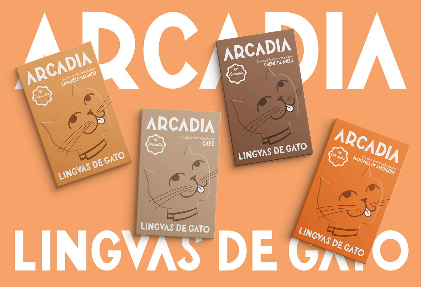
For their 90th birthday, Arcádia decided to reinvent one of their trademark products, the chocolate “cat tongues” made since the 40s, by making a new edition with flavour fillings. Volta’s goal was to create a packaging that payed homage to that heritage while at the same time having the fun and pop effect of the new flavours.
A new flavour for an old friend
—
For their 90th birthday, Arcádia decided to reinvent one of their trademark products, the chocolate “cat tongues” made since the 40s, by making a new edition with flavour fillings. Volta’s goal was to create a packaging that payed homage to that heritage while at the same time having the fun and pop effect of the new flavours.

The typography in the package is a redesign of the lettering featured in Arcadia’s first storefront. With a distinct retro feeling, the bold and strong type is displayed big and proudly on the pack, with the word ARCADIA on the very top, returning to the place it had above the products on the store window.
The cat illustration in the front is borrowed directly from the first “cat tongues” box, made in the 40s. While keeping the original design, the cat’s silhouette is now made only with embossing, which allows us to use it big, front and center and still maintain an elegant feel to the product.
Each new flavour is reflected on a new warn colour palette, which gives a new pop, young mood to the classical “cat tongues”.